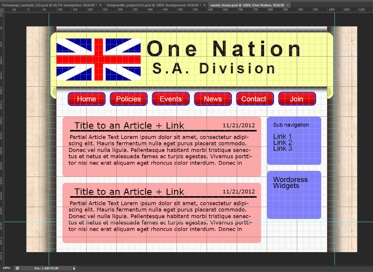
In my online photoshop class that I took at COCC we were given a list of a few websites that we could choose from to redesign; all the choices had horrible designs.
I ended up choosing http://sa.onenation.com.au/. As you can see their site is a horrible mess, this made it hard to put a finger on who they were so that I could create a proper design that conveyed their color scheme and their message. Not to mention this page only seemed to look “okay” in Internet Explorer… lol : \
I decided that the best type of page for them would be a wordpress powered site. I choose wordpress because they seem to have a post-like layout since they just kept throwing new content on top of their old content. They also had a news like feeling to them, because they want their visitors to read their latest and greatest news.
I chose a few interesting textures from SubtlePatterns.com, they were: Lined Paper for the main container background, and Tileable Wood for the body background.
I am not much of a designer, but I did try to make the page less bland than it could have been through the use of textures, I also borrowed a technique that I had read about in an article from webdesign.tutsplus.com where they added a 3D effect to the top navigation, except mine wasn’t a fixed navigation.
This is what I ended up with

One Trackback
[…] I ended up taking a few pointers from an article at WebDesign Tuts+. The article was great and covered the design aspects of a fixed navigation bar, which I used later in my redesign assignment for PhotoShop. […]